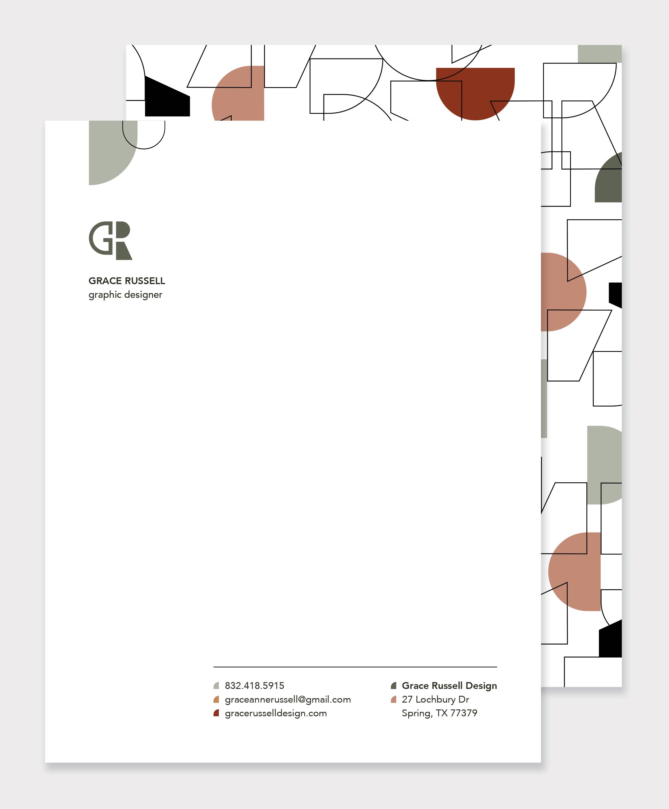
When designing my personal identity, I thought about the way I see the world and what I love to do. I love being in nature and experiencing all of its beauty and complexity of color and shapes that’s been so intentionally created. I enjoy thinking deeply and asking questions to learn more about different aspects of life. I am also a visual thinker, and when creating I often think about the different shapes hidden within objects. I strove to represent these aspects of myself visually in my identity mark. The color palatte is based on soft hues found in nature. The two letterforms “G” and “R” were created by breaking down the elements of a circle and a triangle, thus representing how I love to see “beyond” the surface and think deeply. I chose Avenir as my secondary font because its versatility and simplicity of form fit well with the geometric forms of the “G” and “R.” My goal with this mark is to use the visual play of space to cause the viewer to look again and reflect on the deeper meaning behind its design.


